Quickest Way to the Generic Map Site Layout
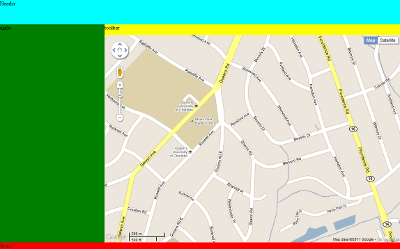
The typical web mapping site is laid out something like this:
 Header, footer, large pane for a map, smaller pane for the verbiage. You’ve seen this a thousand times. If your client is a blabber mouth, you get a right-hand sidebar for verbiage overflow. If your client is left handed, he/she will want to flip the map and side pane around (and no amount of arguing will help - left handed people are notoriously irrational). But that’s basically it. Via some illicit magic (usually JavaScript), the sidebar and map pane size themselves on load and window resize to make the whole thing exactly fill the screen.
This is basically a gut-punch to the HTML/CSS box model and flow. Squint at that image above and tell me what you see.
Yes, that’s right. You see ArcMap. But that’s neither here nor there - in terms of usability it’s not a bad way to go. My point is HTML/CSS don’t naturally want to make a desktop style layout.
I’ve been working on GeoPortal v2 (woot!) whenever I can clear a hole on my desk, and I’ve been looking for the easiest way to make that layout. Most solutions (including what I usually use) involve JavaScript hacks to handle sizing the middle content on page load and window resize. I wanted to make a JavaScript-free version that didn’t include a whole lot of extra DOM objects to do CSS trickery.
Here’s what I came up with. On the good side, there’s zero JavaScript involved. On the bad side, it absolute positions 3 of the 4 content areas. Whenever I absolute position something, I usually rock back in my chair for a minute and try to figure out when exactly it was I became an idiot. But in this case, it’s the simplest, easiest way I can think of to do it.
1 |
|
I tossed a map in there so you get the idea. Essentially the map and sidebar are absolute positioned about 70px from the top and 20px from the bottom. The sidebar is given a width of 300px. The map is given a position of right: 0 and left: 300 (the width of the sidebar).
I can’t say I’m in love with it, but it works. Let me know if you have something better.


