GeoPortal v2.2 is Out
GeoPortal v2.2 is out - get it while it’s hawt.
What’s new in GeoPortal v2.2? Glad you asked.
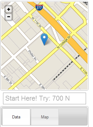 Rearranged, prettied, a gutter on the right for scrolling the page, and controls made for fingers.
- Updated with the latest HTML5 Boilerplate 2 goodies. This includes a new CSS base, modernizr 2, dropping some old cruft, and various tweaks. The only thing I didn't include from boilerplate 2 is Google Chrome Frame, which (a) still creeps me out and (b) robs me of the opportunity to tell IE6 users to suck it, and man, I live for that.
- Greatly improved mobile UX and performance. I moved the map to the top, put the search box beneath it and simplified it, made the tab/accordion buttons finger friendly, added a gutter to the right so you can scroll the page when the map is taking up the whole screen, and a bunch of other stuff. It loads much faster, looks nicer, and is easier to use.
- I added a 3rd mapping library option - Leaflet. Leaflet is still in its infancy (v0.21), but it is by far the smallest, fastest, and easiest to use JS mapping library I've tried. It is astonishingly good, and I'm excited to see where it's going.
- Previously I had a separate config file for each mapping library - one for OpenLayers, one for Google Maps, etc. Now there's a single config file (config.js) that handles all 3 mapping libraries. Basically I abstracted the config file to be map library neutral. In the map-xx.js file for each library it will assemble the layers and map extents as appropriate for it. This means you should be able to edit one config file and rotate through all of the supported mapping libraries. Woot!
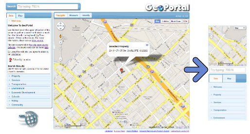
Want to know how the desktop browser to mobile transformation happens?
 wtf?
wtf?1 | @media screen and (min-device-width : 320px) and (max-device-width : 569px) { |
That’s it, the whole shebang. I’m not using Javascript at all for layout (nor would I recommend that, however tempting), so some simple CSS hacks in a media query is all it takes. Of particular interest to jQuery UI users - the last two lines under /* sidebar */ is what makes the accordion and tab buttons big enough for sausage fingers on a mobile device.