QOL Dashboard be Bootstrap-ed!
The problem with having an app written a year before it is needed is that every time I take a look at it after a few months absence I want to toss it and do it over again.
Part of it is development tools and techniques are always changing, but the larger part is my brain changes over time (+/- delta on that is debatable). This bit by Jeff Atwood sums it up nicely:
In fact, I think you can tell a competent software developer from an incompetent one with a single interview question:What’s the worst code you’ve seen recently?
If their answer isn’t immediately and without any hesitation these two words:
My own.
Then you should end the interview immediately.
The worst code I have ever seen is the code I wrote six months ago. As long as you can always say that as a developer, you will do fine. But I digress.
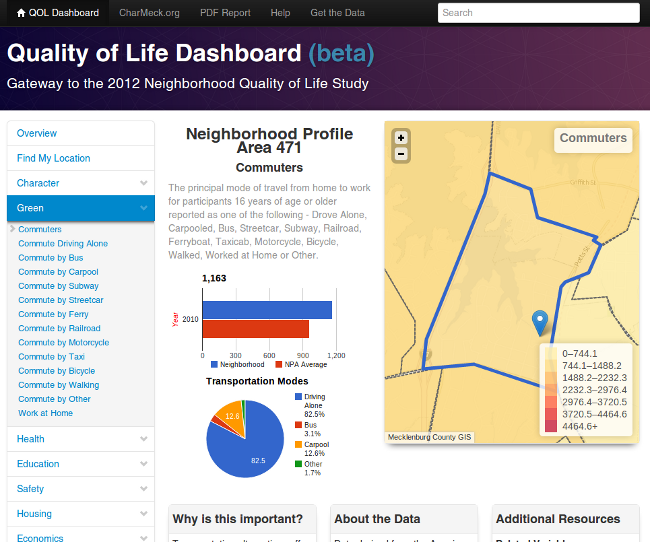
A fresh look at the Quality of Life Dashboard left me somewhat horrified. It was the ubiquitous sidebar + map taking up 3/4 of the page I-wanna-look-like-ArcMap layout. The map really isn’t the thing for this site (gasp!). It is ancillary. Combine that with my recent unbridled love-fest with Bootstrap and it was time for an overhaul.
New Stuff:
- Built with Bootstrap. The only exception is the autocomplete, which is still jQuery UI. Bootstrap handles responsive design so well I barely had to touch anything to get it to go from PC to tablet to phone. I built my own kinda-collapsible with jQuery (like ~5 lines of code) so it would all go in the sidebar with non-collapsible links.
- Out with Google, in with Leaflet. That gives me more choroplething buckets and...
- The neighborhood layer is now GeoJSON, which combined with leaflet lets you do easy on-the-fly hover/selection/choroplething.
Feel free to take a gander or grab the code. Caveat emptor: I haven’t gone back through to pretty up the JavaScript/CSS yet; there’s a possibility you could go blind.