The Google Maps Inset Shadow Thing
Google recently redesigned a number of their sites, including Google Maps. One of the things they did was make a subtle inset effect on the map, so it looks slightly below the header and sidebar.
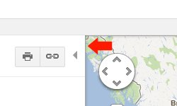 Ooooh. Subtle.
That’s pretty nifty. So of course I immediately set about stealing it.
From what I can tell from sorting through the code (note: looking at a Goggle app’s code is not for the faint of heart), that isn’t a box shadow. It’s a set of 5 div’s with extremely small widths, each with slightly decreasing opacity. When I saw that I threw up in my mouth a little bit. There are limits to what I’ll do to my page markup for eye candy, and that crosses the line by about 4 divs.
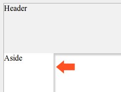
Here’s my take on that effect. First, a header, aside, and map.
1 | <header>Header</header> |
Yep, I’m that lazy. Now a little CSS magic.
1 | header { background: #F1F1F1; } |
 I'm too sexy for this blog.
There’s nothing you haven’t seen before - some absolute positioning to get the middle content to act like it’s a desktop app and resize the width and height to the browser size. The only two specials bits are:
- Give the map a z-index of -1 so it sits below everything else.
- Note the aside's box-shadow. The box-shadow arguments are horizontal offset, vertical offset, blur radius (optional), spread radius (optional), and the color. You don't see the spread radius used very often. By using a negative value there, you can squeeze it in a bit so the shadow will only appear on one side of the box. Without that you would see the shadow leaking through between the aside and the header.
This is a much simpler and more semantic way to make that effect. The down side? You won’t see the shadow in oldIE (<9). I’m OK with that - it’s apple-polishing, not a critical function. Plus, it almost goes without saying that oldIE can suck it. Almost.