Simple Shapes With CSS
After deciding to do some simple side-floating previous and next links on ye olde blog, I thought a quick post on creating a few simple shapes with CSS was in order.
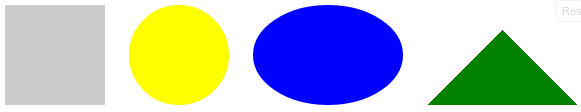
Those triangles on the side are not images. They are DIV’s with a little CSS. (Edit: not anymore. Already switched them to unicode triangles. The rest of this tutorial is still good though.) Let’s take a look at making 4 basic shapes with CSS - rectangles, triangles, circles, and ovals.
Here’s our HTML:
1 | <div id="rectangle"></div> |
First I’ll insult your intelligence with a rectangle.
1 | #rectangle { |
Sorry. Had to do it.
Next, check out a triangle. Thing of it like a gigantic 3d border corner. You can move the left/right/top/bottom around to change the orientation of the triangle.
1 | #triangle { |
Now for the circle stuff. Note we’re using border-radius to create circular shapes. If you give a toss about people on oldIE, you will need to have a fall-back image unless you are just apple-polishing. Equal width and height creates a circle; uneven width and height creates an oval.
1 | #circle { |
You can jsFiddle with these shapes to try different settings.
This is a quick and handy technique to make some basic shapes without busting out Inkscape, and in lieu of an image it decreases page load time and bandwidth. In a few years time we will all scrap stuff like this for SVG, but for now it is a handy technique to put in your trick bag.