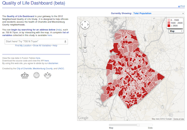
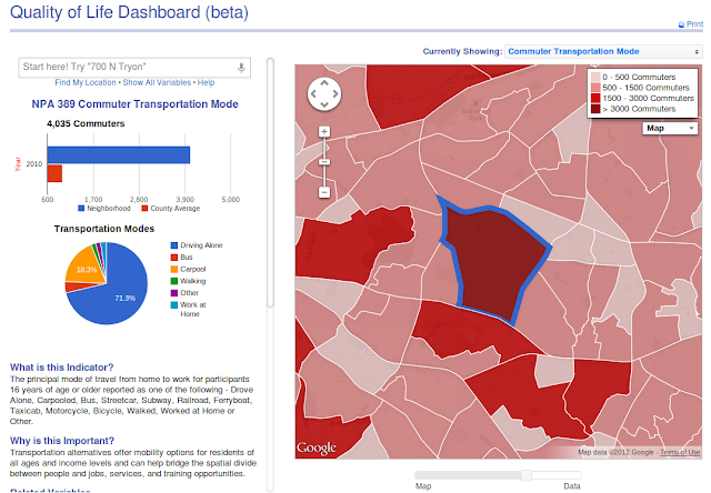
New Quality of Life Dashboard Design
In case you were wondering, this project hasn’t gone away. The data isn’t due until December now, and the application won’t be due until ~15 minutes after that (give or take). I recently redesigned the whole thing, eschewing our “standard” SharePoint look due to all the usability problems it brings with it. You can see the beta site here and the code is sitting on Github.
I have to give a bit hat tip for the new look to Derek Eder and his FusionTables Map Template. Although I didn’t use any of his code, the clean aesthetic he created was a big inspiration for the new design.